
Peaceful Olive Two Ways

This year I'm determined to get a head start on my Christmas card production so that I don't end up in a blind panic come November/December.
And to do this, I'm trying to make a Christmas card each week behind the scenes.
We'll see how that goes, as I'm already a few weeks behind... So, fair warning, this probably won't be the first Christmas card project I share well in advance of December!
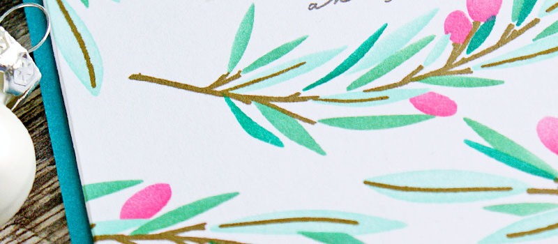
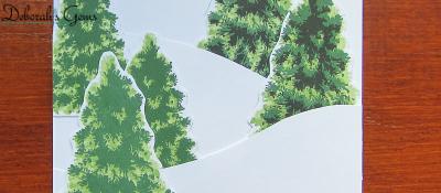
The Peaceful Olive stamp and stencil set from The Greetery debuted as part of their festive release in 2022, but I think it lends itself well to creating interesting backgrounds any time of the year.
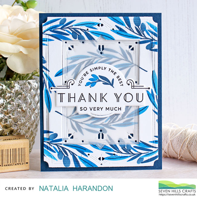
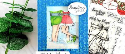
So before I share my festive take on this set, here's a Thank You card I made inspired by the blue tones of Delft pottery.
The set contains four layering stencils for you to lay down all the colour of the olive branches, and you simply stamp the actual branch detail to complete the look. The stamping guide included suggests a colour combo and also provides tips.
So the background comes together in no time.
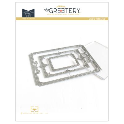
I decided to go all fancy with this card, so ran the background panel through my die-cut machine with the largest die in the Deco Frames set and ran it through again with the middle die in this set to create an aperture and dimensional frame to showcase the sentiment.
I also cut a piece of vellum with the middle Deco Frame to soften the look of the centre area.
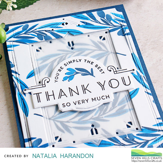
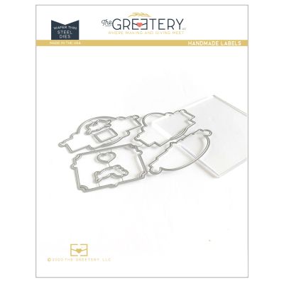
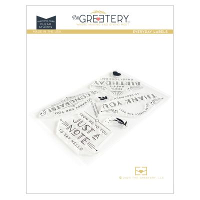
I found the perfect sentiment for this card in the Everyday Labels stamp set, as there's a branch motif in this set that echoes the look of the olives. (The Everyday Labels stamp set is currently out of stock, but you can use the notification feature to be emailed when they become available again.) The coordinating Handmade Labels die for this sentiment was also the perfect size to hide where I had glued the vellum piece in place.
All those fancy cut marks on the Deco frames and the Deco style of the sentiment label make for quite a striking card.
This design would also work nicely with zingy colours too, and not just a monochromatic look.
~~~~~~~~~~
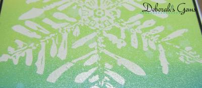
My festive take on the Peaceful Olive set is a total contrast.
This time I wanted to keep things clean and simple, yet non-traditional.
I went with a colour combo using aqua tones through to jade and peacock with a hit of hot pink for the olives.
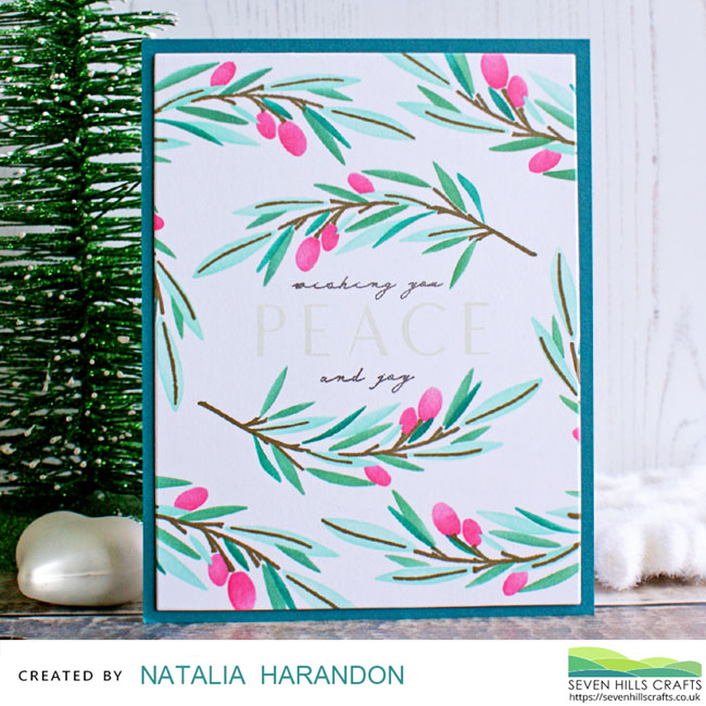
I toyed with heat embossing the "PEACE" sentiment, but instead I reached for a light grey inkpad and then dark grey for the surrounding text.

Top tip: If you have the coordinating die set which includes the word "PEACE" cut out in individual letters, you can stamp the sentiment in a very light grey as a guide to lining up the die cut letters on your card.
The end result is striking and classy. This design would definitely work for production line assembly if you need to make several cards in one go. I may need to resort to this if I don't catch up any time soon!
Until next time, happy crafting!
April 26, 2023
|
View: 307
|
Categories: Die Cutting, Card Making, Stamp Layering, Stamped Background, Stamping, Layering Stencils, Clean & Simple, Stencilled backgrounds, Inlaid Die Cutting, Clean and Simple (CAS)
|
Tags: The Greetery
|
By: Natalia
About the Author


Related Products


Controversial Santas
August 28, 2022

Birthday Forecast
February 14, 2022

Encouraging Leaves
March 15, 2021

Framed Snowdrops
February 22, 2021

Altenew 6th Anniversary Blog Hop Day 4 + Giveaway
April 5, 2020
Christmas Socks
October 26, 2024
Bright Quirky Stripes
October 24, 2024

True Story with Concord & 9th
October 23, 2024
Postage Collage Christmas Card
October 22, 2024
Overlapping Christmas
October 19, 2024