
Bridgerton Buzz

Morning all!
I'm back with a brand-new card, shamelessly inspired by a certain Miss Featherington and her new wardrobe.
Yes, love it or hate it, everywhere you look it's Bridgerton central at the moment.
As someone who first read the books more than a decade ago (and has reread Penelope and Colin's story more times than I care to admit) I have been looking forward to Season 3 arriving on Netflix - and having binged it in one evening - I, of course, am now patiently waiting for the other half of Season 3 to drop next month!
Fear not - no spoilers here!
But one of the inspirations from the book and series is the colour palette Penelope leans into once she ditches the citrus gowns favoured by her mother.
Soft lilacs and powder blues become a favourite, and well, they make a great colour combo for card projects too!
~~~
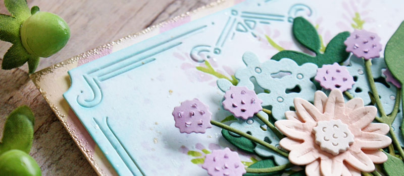
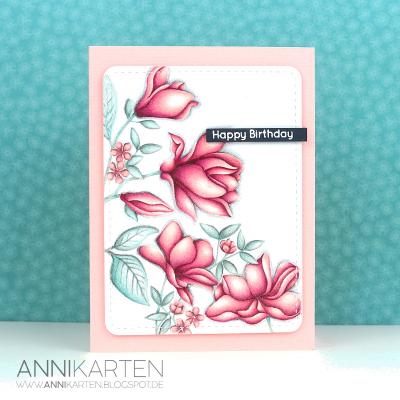
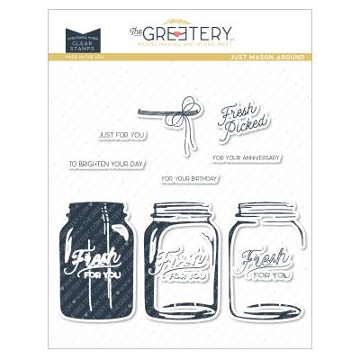
One of my very first purchases from The Greetery was the Just Mason Around layering stamps and coordinating dies.
A real staple!

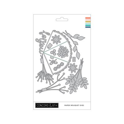
I've been looking for other ways to stretch the Paper Bouquet dies from Concord & 9th further, and I am happy to report that this Mason jar is the perfect size to accommodate them.
I started out by cutting out the Mason jar and stamping it in three shades of plum ink. Personally, I always start with the stamp that adds the darkest shade so that I can line up the text easier on the next two layers. For a more subtle transition between the layers, you can use just one shade of ink to stamp all three layers.
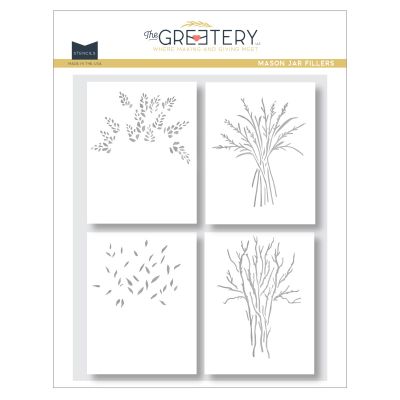
Next, I stencilled the lilacy branches from the Mason Jar Fillers stencil set on a white A2 cardstock panel - this stencil set includes a few different looks to create a fuller background to the Just Mason Around jar and contents and could also be used on its own.
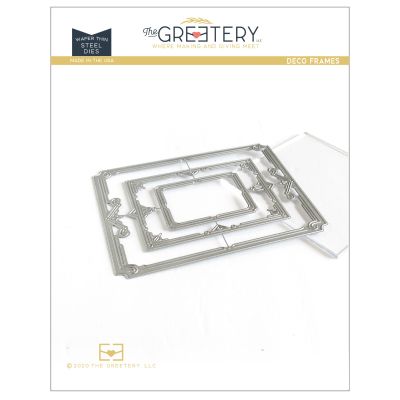
I grabbed the Deco Frames die set to cut this background panel down to size and then went in with my light blue blending brush and just added ink around the edges and around the stencilled branches with the ink that was already on the brush.
This card called for some sparkly detail too, so I splattered the panel with pearlescent and metallic watercolour paint, plus some extra splatter of the lilac I used for the branches.
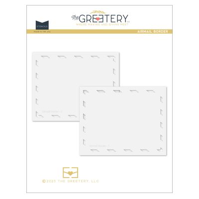
As a backdrop to the Deco Frame, I used a light lavender ink to stencil the Airmail Border layers on another A2 panel of white cardstock. I went around the edges with Antique Linen Distress ink just to soften the look.
~~~
Top tip for the Airmail border stencils: If you don't quite ink right to the edges of your A2 panel, you can trim it down a little or glam it up by smooshing the edges of the panel into a Versamark ink pad and embossing with some metallic powder. The more distressed the look, the better. I used Platinum embossing powder here, and it adds just the right amount of glam.
~~~
With all those elements made, it was time to return to the main star of the show!
The Paper Bouquet.
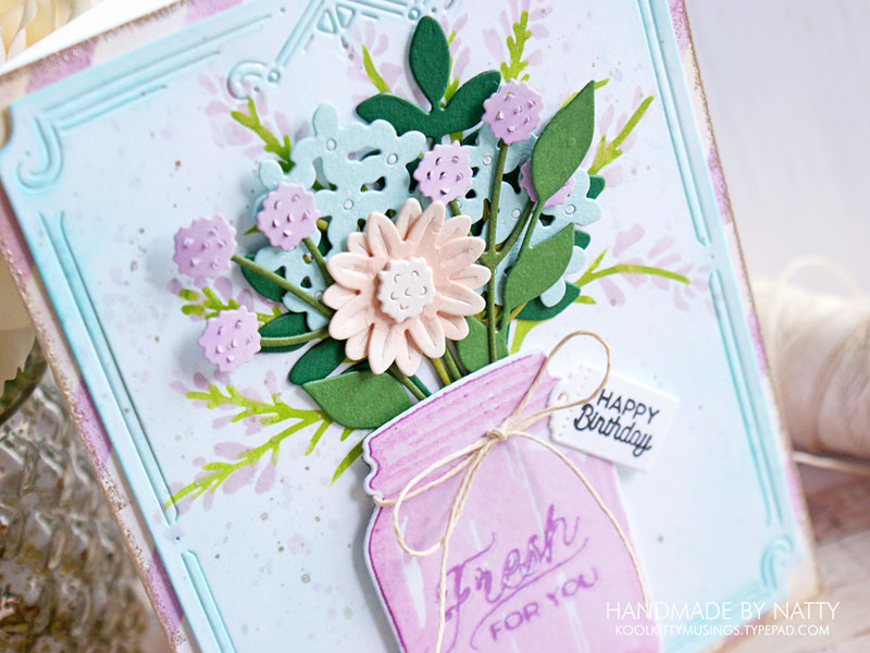
I continued with the pale blue and lilac colour scheme, and threw in a peachy blush pink for good measure (with a little extra ink shading)!
I assembled the bouquet as normal and as you can see it's a great fit for the jar and the jar filler stencils.
To finish off my card, I stamped a small sentiment on one of the tags from the Sentiment Suite Basics die set and tied it onto the jar with twine.
Who knows, when the second half of Season 3 drops next month, there may be more Bridgerton-inspired cards in my future!
Until next time, happy crafting!
May 22, 2024
|
View: 286
|
Categories: Card Making
|
Tags: Concord & 9th, The Greetery
|
By: Natalia
About the Author

Related Posts

The blog is back!
February 16, 2020| Posted in Colouring Stamped Images, Copic Colouring, Pencil Colouring, Die Cutting| Admin| 6| 1173
Pottery Crazy
February 17, 2020| Posted in Die Cutting, Stencilling, Stencilling with embossing paste, Special Effects| Admin| 1| 1380
Floral Focus
February 22, 2020| Posted in Colouring Stamped Images, Pencil Colouring, No Line Colouring| Admin| 2| 730
Related Products

Controversial Santas
August 28, 2022

Birthday Forecast
February 14, 2022

Encouraging Leaves
March 15, 2021

Framed Snowdrops
February 22, 2021

Altenew 6th Anniversary Blog Hop Day 4 + Giveaway
April 5, 2020
Postage Collage Christmas Card
October 22, 2024
Overlapping Christmas
October 19, 2024
Stay Cozy, This Or That?
October 17, 2024
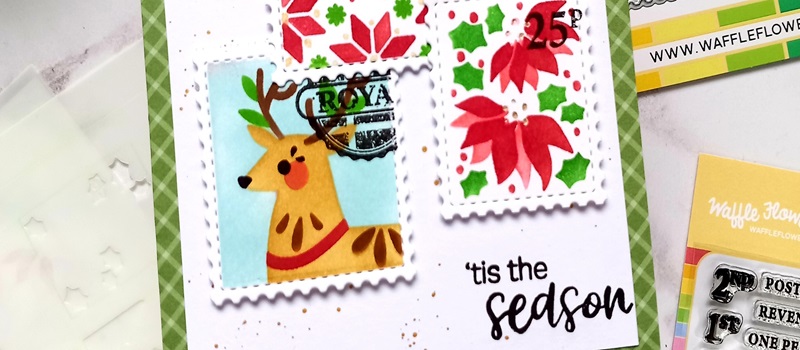
Poinsettia Postage Collage with Waffle Flower
October 16, 2024
Whoosh Kites with Colouring Stencils
October 15, 2024